Recently I wanted to use a horizontal navigation menu on a website. I wanted the items in the menu to be evenly distributed across the width of the page, but also butting up against each other, with no space between each item. The other requirement was that the spacing between the text of each item should be equal.

Fluid width menu with justified items, each one with the same padding applied
Same menu on a smaller width screen, demonstrating the fluid sizing
I asked on the sitepoint forums whether this would be possible with CSS, given that the number of items in the menu is unknown, and the width of the text for each item and the menu itself is also unknown. The answer was that it may be possible with flex-box, but really it would require javascript for a cross browser solution.
I am a strong believer in progressive enhancement. This means make the structure of the page (HTML) as good as possible. Then make the layout as good as possible using CSS. And finally make further improvements using javascript.
So I decided to use table display with a fixed table layout for the base CSS. Then I worked on the javascript to lay out the menu in a justified fashion.
On the sitepoint forum thread it was mentioned that this was a repeated request
, so I thought I’d put a bit of work in, and try to write a justify javascript function that could be used as a universal solution. To this end I’ve written an example page with menus styled using various CSS methods, and also the ability to apply the justify menu javascript.
I’ve structured the menus using the standard unordered list method. I’ve also included submenus under option one and option four. I couldn’t get the submenus to display properly in IE7, so I have used a conditional comment to keep them hidden in IE 7 and below.
The length of the text for each item varies so you can see how the menus look.
For all the menus I’ve applied a black background to the ul. You wouldn’t want to do this in real usage, but helps make clear the relation between the list items and the ul for the purposes of the example.
Most of the menus have whitespace between the list items, that is, the HTML looks like:
<ul class="table">
    <li><a href="#">Option 1</a>
        <ul>
            <li><a href="#">Sub Opt 1</a></li>
            <li><a href="#">Sub option two</a></li>
            <li><a href="#">3</a></li>
        </ul>
    </li>
    <li><a href="#">Option Two</a></li>
    <li><a href="#">Opt 3</a></li>
    <li><a href="#">This is option four</a>
        <ul>
            <li><a href="#">Sub Opt 1</a></li>
            <li><a href="#">Sub option two</a></li>
            <li><a href="#">3</a></li>
            <li><a href="#">A fourth option here</a></li>
        </ul></li>
    <li><a href="#">Option 5</a></li>
</ul>
Rather than:
<ul class="table"><li><a href="#">Option 1</a><ul><li><a href="#">Sub Opt 1</a></li><li><a href="#">Sub option two</a></li><li><a href="#">3</a></li></ul></li><li><a href="#">Option Two</a></li><li><a href="#">Opt 3</a></li><li><a href="#">This is option four</a><ul><li><a href="#">Sub Opt 1</a></li><li><a href="#">Sub option two</a></li><li><a href="#">3</a></li><li><a href="#">A fourth option here</a></li></ul></li><li><a href="#">Option 5</a></li></ul>
In some cases whitespace between the items can have an effect. (Originally my javascript solution used inline-block, and required that there be no whitespace between the list items).
Horizontally justified menu using CSS
Table layout
The first few examples show the menu with the following css:
ul{
	display: table;
	table-layout: fixed;
}
li{
	display: table-cell;
}
This lays out the menu like a table, with each column the same width. Table layout is not supported on IE7 and lower.
Unfortunately, if you have a long menu entry, then that entry will be wrapped onto multiple lines. This can cause issues, as that one menu item becomes taller than the other items.
To get round this, I have applied the CSS rule of white-space: nowrap to the anchors. This prevents the text wrapping, however this does mean that the long text will get cut off when the menu is forced to a small size.
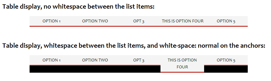
Table display menu with white-space: nowrap vs white-space: normal on a large screen
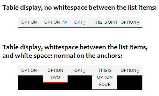
Table display menu with white-space: nowrap vs white-space: normal on a smaller screen
Next up, we have another menu with table display, but table-layout: auto;. This makes each ‘column’ of the ‘table’ adjust to the size of its contents, rather than making each column the same width.
The issue with this method of display (at least for me), is that the larger menu items have more ‘padding’ applied to them than the smaller menu items.
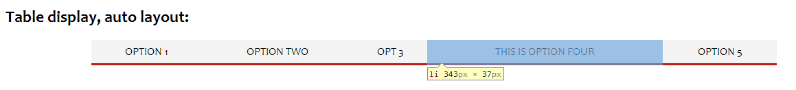
Table display with auto layout showing the large amount of ‘padding’ applied to the item with the largest amount of text
Another issue is that when a sub menu is shown, it will expand the width of the parent list item. (I must admit, I’m not sure why this happens?)
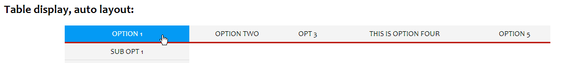
Table display with auto layout when a sub menu is displayed.
This can be resolved by using absolute positioning on the sub menus, but then you can end up with sub menus that are smaller in width than their parents (which looks strange to me).
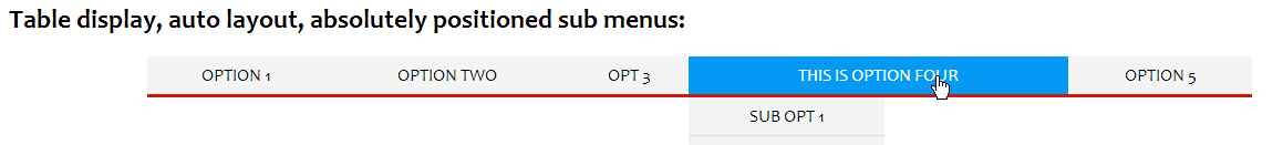
Table display with auto layout and absolutely positioned sub menus
Underneath that, we have a couple of examples of a fixed table layout menu with padding applied. The purpose of these is mainly to see how they are affected by the javascript solution.
Flex display
Flex display can be used to set the menu out exactly how I wanted, a pure CSS solution. Unfortunately it is not widely supported by browsers at the moment. In Firefox it works nicely. Chrome / Webkit requires a vendor prefixed syntax. IE10 is meant to support a vendor prefixed syntax, but I haven’t been able to get it working.
The basics of the flex CSS method are:
ul.flex{
    display: flex;
    flex-direction: row;
    flex-wrap: nowrap;
}
ul.flex li{
    display: block;
    flex-grow: 1;
}
display: flex;- sets the
ulup as a flex container. flex-direction: row;- says that we want the children (list items) laid out horizontally in a row.
flex-wrap: nowrap;- stops the items wrapping onto a new row when the menu width is small
On the list items we set flex-grow: 1;, this is what makes the list items automatically stretch to fill up the menu width. Unlike table display with auto layout, flex adds the same amount of ‘padding’ to each list item.
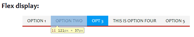
Menu with flex display
A very good description of the flex layout can be found at CSS-tricks – A Complete Guide to Flexbox.
Update 2013-08-03: Thanks to Paul O’B over on the sitepoint forums, who pointed me to this guide for Flexbox Syntax for IE10. In IE10 you must add the rule -ms-flex: 1 to the list items, rather than -ms-flex-grow: 1. And display: -ms-flexbox to the ul / ol rather than display: -ms-flex.
However, Flex works differently in IE10 than how it does in Chrome and Firefox. In IE10 the menu is displayed with each item having the same width, the same as a fixed layout table display. I haven’t tried the IE11 preview, so I’m not sure how IE11 will treat Flex display.
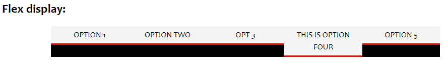
Menu with flex display in IE10
Inline Justified
This method was developed by CSS guru Paul O’B and posted in reply to my question over on the sitepoint forums. Unfortunately it needs a very specific way of writing the HTML for the menu, one that you are unlikely to come across in actual usage.
My examples are using the same HTML as the other examples, and so I was not able to replicate the effect. However, you will see that the anchors are justified (but have space around them).
You can view Paul’s example here: Equally justifed menu – Firefox only.
With dividers / separators
The last example uses a fixed table layout again, but I have added separators between the items. The separators are just a pipe character | added as CSS generated content. You can use the same CSS to add separators to a flex layout.
ul.dividers li a{
    position: relative;
}
ul.dividers li a:after{
    content: '|';
    position: absolute;
    left: -1.5px;
    z-index:2;
}
ul.dividers li:first-child a:after, ul.dividers ul li a:after{
    content: '';
}

Menu with dividers / separators added between the items
The :after pseudo class is not supported in IE7 and below, so this won’t work for that browser.
Justifying the Menu using javascript
I developed a javascript solution that should hopefully work well to justify most horizontal menus.
It works by making the list items wrap to their contents. After doing this it can calculate how much spare space is left in the menu. Then this spare space is divided between the number of list items, and applied as padding to the anchors.

I paused the javascript part way through to demonstrate how it works out the spare space to be distributed as padding among the links
The function takes three parameters:
- The ul (or ol) element that is the menu you want justified
- A minimum amount of padding that should always be applied to the anchors. Note this is a single number (of pixels), and is only applied to the left and right. Top and bottom padding is not modified by the javascript at all, so it will stay whatever you have set in the CSS.
If you do not specify a value, a default value of 5 will be used. - A minimum width at which the function should justify the menu. This allows use of responsive design. So you could set the javascript to justify the menu for screen widths larger than 600 pixels (for example), and use a CSS media query to display the menu in a different way (or hide it completely) for widths 600 pixels or less.
A menu can be justified like so:
//justify menu with 10px min padding and only when the screen width is 500 pixels or greater
new justifyMenu(document.getElementById('mymenu'),10,500);
//justify menu with default padding (5px) at all screen widths
new justifyMenu(document.getElementById('myothermenu');
The javascript does not require jQuery. However, this does mean that it requires a couple of helper functions. These helper functions are only a few lines though, and will load a lot faster than a full js library like jQuery. If anyone has interest in a jQuery version of this function, please let me know.
Although the javascript mostly uses inline CSS for modifying the menu, there is one CSS rule that you must add to your stylesheet:
ul.jstified:after {
    content: "";
    display: block;
    height: 0;
    clear: both;
}
This rule is needed to prevent the unordered list container from collapsing. Because the javascript floats the list items, we need to clear the float after the last item, which is what this rule does.
The justify menu function will not work properly with menus where margins have been applied to the list items or padding has been applied to the ul / ol.
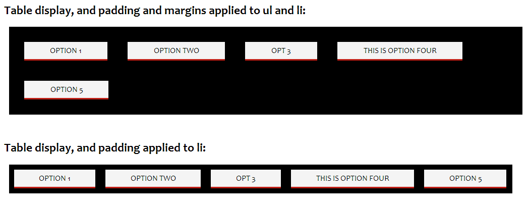
Menus with padding and margins applied after justifying with the javascript function
If you look at the examples titled Table display, and padding and margins applied to ul and li
and Table display, and padding applied to li
after applying the javascript, you can see that the padding is preserved and the menu is justified correctly when only padding is applied to the list items.
However when margins are applied as well, the menu is not justified correctly. This is because the javascript cannot work out the width of the item when margins have been applied. If anyone knows of a way to get the width of an element including margins, I’d love to know!
The actual javascript
I’ve heavily commented the javascript, so it should hopefully be easy for you to understand what it does and why. For production use you would probably want to run it through a minifier to at least get rid of all the excess whitespace and comments.
You can view the javascript by just viewing source on the example page, or see below:
Helper functions:
/**loop through an array / list, passing each item in the list to the callback function
 *The callback function receives two arguments, the current item in the list, and the index of that item in the list
 *If the callback function returns false, then the loop will exit
 *(Taken from http://www.sitepoint.com/jquery-vs-raw-javascript-3-events-ajax/)
 *@param obj The array or nodeList to loop through
 *@param fn The callback function that each item in the list will be passed
 */
function Each(obj, fn) {
	if (obj.length) for (var i = 0, ol = obj.length, v = obj[0]; i < ol && fn(v, i) !== false; v = obj[++i]);
	else for (var p in obj) if (fn(obj[p], p) === false) break;
};

/**
 *Cross-browser method to attach an event listener
 *@param HTMLObject el The element to attach the event listener to
 *@param string eventType The type of event to listen for
 *@param function fn The function to fire when the event occurs
 */
function addEvent(el, eventType, fn) {
    if (el.addEventListener) {
        return el.addEventListener(eventType, fn);
    }
    else if (el.attachEvent) {
        return el.attachEvent('on'+eventType, fn);
    }
    return false;
}

function removeEvent(el, eventType, fn)
{
	if(el.removeEventListener != undefined)
	{return el.removeEventListener(eventType, fn, false);}
    if(el.detachEvent) //IE
	{return el.detachEvent('on'+eventType, fn);}
    return false;
}
justifyMenu function:
/**
 *Space items equally across a horizontal menu so that they fill the whole menu by applying
 *the same amount of padding to the anchor element contained in each list item.
 *@param HTMLObject menu The ul or ol html object that is the menu
 *@param number minPadding The minimum amount of padding to apply
 *@param number minWidth Minimum screen width at which the function will be applied
 */
function justifyMenu(menu,minPadding,minWidth) {
    //check we have an ol or ul menu
    if (menu.tagName != 'UL' && menu.tagName != 'OL') {
        throw new TypeError('menu should be an unordered or ordered list HTML Object');
    }
    //initialise some variables
    var lis = menu.children;
    //set minPadding to a default value of 5 if not provided
    minPadding = (typeof minPadding == 'number') ? minPadding : 5;
    //set minWidth to 0 if not provided
    minWidth = (typeof minWidth == 'number') ? minWidth : 0;
    //clientWidth property used to avoid problem with continuous window.resize event firing in IE7
    var oldClientWidth=0,
    //whether the css has been set up on the ul / ol and submenus (i.e. has the init function been fired)
    ready=false,
    //object to hold current inline css styles on the elements that will be changed, so we can later revert to the original settings
    oldSettings = {"menu":{"display":menu.style.display,"className":menu.className},"lis":[],"as":[],"submenus":[]};

    //save the old settings (will probably all be empty)
    Each(lis, function(el,i){
        //list items
        oldSettings.lis[i]={
            "el":el,
            "display":el.style.display,
            "cssFloat":el.style.cssFloat,
            "styleFloat":el.style.styleFloat
        };

        //get the child anchor tag
        Each(el.children, function(el){
            if (el.tagName == 'A') {
                oldSettings["as"][i]={
                    "el":el,
                    "paddingLeft":el.style.paddingLeft,
                    "paddingRight":el.style.paddingRight
                };
            }
        });
    });
    //submenus
    if (menu.querySelectorAll) {
        var submenus =  menu.querySelectorAll('ul, ol');
        if (submenus.length) {
            Each(submenus, function(el,i){
                oldSettings.submenus[i]={
                    "el":el,
                    "position":el.style.position,
                    "top":el.style.top,
                    "zIndex":el.style.zIndex,
                    "height":el.style.height
                };
            });
        }
    }

    //re-justify the menu when the window is resized
    addEvent(window, "resize", justify);
    //justify the menu
    justify();

    /**
     *Removes the inline css styles set to justify the menu, and restores the original inline css styles (if there were any)
     */
    function reset() {
        //reset ul/ol
        menu.style.display=oldSettings.menu.display;
        menu.className=oldSettings.menu.className;
        //reset list items
        Each(oldSettings.lis, function(old){
            var s=old.el.style;
            s.display=old.display;
            s.cssFloat=old.cssFloat;
            s.styleFloat=old.styleFloat;
        });
        //reset anchors
        Each(oldSettings["as"], function(old){
            var s=old.el.style;
            s.paddingLeft=old.paddingLeft;
            s.paddingRight=old.paddingRight;
        });
        //reset submenus
        if (oldSettings.submenus.length) {
            Each(oldSettings.submenus, function(old){
                var s=old.el.style;
                s.position=old.position;
                s.top=old.top;
                s.zIndex=old.zIndex;
                s.height=old.height;
            });
        }
        ready=false;
    }

    /**
     *Set the CSS for the ul / ol and submenus
     */
    function init() {
        menu.style.display='block'; //IE
        menu.className+=' jstified'; //Make menu wrap to height of floated children

        //Change the way that submenus are positioned to prevent them expanding the width of the parent when they are displayed
        if (menu.querySelectorAll) {
            var submenus =  menu.querySelectorAll('ul, ol');
            if (submenus.length) {
                Each(submenus, function(el){
                    var s=el.style;
                    s.position='absolute';
                    s.top='100%';
                    s.zIndex = 1;
                    s.height = 'auto';
                });
            }
        }
        ready=true;
    }

    /**
     *Justify the menu contents
     */
    function justify() {
        var clientWidth=window.innerWidth || document.documentElement.clientWidth; //old IE uses document.documentElement.clientWidth for window size
        //in IE7 window.resize is called whenever any element is resized
        //So we need to check whether the window size has actually changed or not
        if (oldClientWidth==clientWidth) {
            return;
        }
        oldClientWidth=clientWidth;

        //if the window width is smaller than the min width set, then remove any changes we have made
        if (clientWidth<minWidth) {
            if(ready){
                reset();
            }
            return;
        }
        //if this is the first time the function is fired, or we're moving from a window size smaller than midWidth to larger, we need to fire the initialize function
        if (clientWidth>minWidth && !ready) {
            init();
        }

        //initialise some variables
        var contentWidth=0,
        as=[],
        menuWidth;

        //set the list items to wrap to their contents and get their width
        Each(lis, function(as){return function(el){
            el.style.display='block';
            el.style.cssFloat='left';
            el.style.styleFloat='left'; //IE

            //get the child anchor tag
            Each(el.children, function(as){return function(el){
                if (el.tagName == 'A') {
                    //reset the anchor padding to the minimum
                    el.style.paddingLeft=minPadding+'px';
                    el.style.paddingRight=minPadding+'px';
                    //add the anchor to the array of anchors to have their padding modified
                    as.push(el);
                }
            }; }(as))
            //now we can get the width of the list item
            contentWidth+=el.offsetWidth;

        };}(as));

        //only justify the menu items if they are smaller with the minimum padding applied than the menu width
        if (contentWidth < (menuWidth=menu.offsetWidth)) {
            //Taking the contentWidth away from the menuWidth gives us the total spare space
            //Dividing the spare space by the number of list items gives us the total padding to apply to each item
            //Dividing this by 2 gives us the amount of padding to apply left and right
            var padding=(menuWidth-contentWidth)/(lis.length*2)+minPadding;
            Each(as, function(el){
                el.style.paddingLeft=padding + 'px';
                el.style.paddingRight=padding + 'px';
            });
            //when the list has a percentage size and it's width is the same size as the content with padding applied,
            //then the last item will be pushed down onto the next row.
            //The browser rounds up the menu width when reporting it
            //To fix, we'll make the padding right on the last item 1 pixel smaller
            //And for IE10 this isn't good enough, so we'll make the padding left on the first item smaller as well
            as[as.length-1].style.paddingRight=(padding-1) + 'px';
            as[0].style.paddingLeft=(padding-1) + 'px';
        }
    }

    /**
     *Stop listening for resize events and reset the menu css back to the original appearance
     */
    this.remove=function() {
        removeEvent(window, "resize", justify);
        reset();
    }
}
IE6 support
As it is, the javascript doesn’t work in IE6. If you need IE6 support, it can be modified by setting the anchors’ display to inline and zoom to 1, e.g.
            //get the child anchor tag
            Each(el.children, function(as){return function(el){
                if (el.tagName == 'A') {
                    //reset the anchor padding to the minimum
                    el.style.paddingLeft=minPadding+'px';
                    el.style.paddingRight=minPadding+'px';
                    if(IE==6){
                        el.style.display='inline';
                        el.style.zoom=1;
                    }
                    //add the anchor to the array of anchors to have their padding modified
                    as.push(el);
                }
            }; }(as))
In the example above I am checking a variable IE to see if it is equal to 6. You will need to make sure this variable is set, as it is not some special variable automatically set by IE. In the example page I am using IE conditional comments to set the value of the IE variable to 6 (for IE6), 7 (for IE7), or false for all other browsers.
You will also need to modify the parts where the original inline css styles are saved and restored. Otherwise when the window is resized to the minwidth, the inline display will still be applied to the anchors.
        //get the child anchor tag
        Each(el.children, function(el){
            if (el.tagName == 'A') {
                oldSettings["as"][i]={
                    "el":el,
                    "paddingLeft":el.style.paddingLeft,
                    "paddingRight":el.style.paddingRight,
                    "display":el.style.display,
                    "zoom":el.style.zoom
                };
            }
        });
        //reset anchors
        Each(oldSettings["as"], function(old){
            var s=old.el.style;
            s.paddingLeft=old.paddingLeft;
            s.paddingRight=old.paddingRight;
            s.display=old.display;
            s.zoom=old.zoom;
        });
If you have any comments or suggestions (I’m sure improvements could be made), please leave a comment below or you can email me on info@.
I really liked this summary of methods with code and example usage all in one file.
For the Justified example I wonder whether there is a way to keep the “ul li a” positions same with and without :hover? As it is you get into an flickering loop when you hover at the end of the string.
Thanks for the feedback Roland. The justified CSS examples flicker when the item contains a sub menu. Since the main menu items didn’t display how I wanted, I didn’t really look into fixing the flickering (inaccessible) sub menus issue with this CSS method.
I expect it can be fixed, I’ll take a look at it sometime and post back here.
Hi Roland
Long delay, but I’ve had a look at this now. The flickering can be resolved by setting
float: lefton the ul submenu.However, the submenu takes up the width of the entire menu when it is displayed. I can’t figure out a way to prevent this while keeping the parent lis as
display: inline, which is needed for the justified one to work.I think the justified css menu would only work okay for single level menus with no submenus.
Dave